Thursday, 17 December 2009

Wednesday, 16 December 2009

Picture editing.

 These are some examples of pictures that i have edited to fit into the magazines style.

DoublePageSpread -


Front Cover


Development:


Thursday, 19 November 2009

Sunday, 11 October 2009

Third times the charm - Music Magazine NME Frontcover / Contents page


The NME uses the same colour scheme throughout the fron cover, uses colours such as black white and red, three colours that contrast each other sperately yet they blend effectively together. This makes the articles stand out can the magazine can be recognised  using their own unique style. Similar to the previous magazines i have researched, there is just one main image placed above the magazines logo. This gives the impression that the NME also believes the layout of the magazine is so recognisable and unique, their logo doesnt need to be at the front for it to stand out. The image is placed on the left allowing room for other articles that arent related to the picture to stand out. Pugs and page borders include a yellow colour so that they stand out from the other text. Red text is used for titles and depending on the background, white or black is used in the smaller font to describe the article.

Similar to the cover, Red, black and white are the main colours used (gives impression that the whole magazine uses these colours throughout.) Similar to the "Q" Magazines layout, one main image is used, and opposite shows the articles within the magazine, However, one article is placed below this image (i am unsure if it continues later on in the magazine however.) The page also features an advertisement to subscribe to the magazine, this is a feature that i have not seen in my research, and i believe that this is nto effective as the user hasnt read the magazine yet, and unsure if they would want to read the magazine again. the page numbers appear to only show the more important articles, and not all of the articles.

Rinse and Repeat - Q Magazine Front Cover & Contents


The layout of the cover is very basic, one main image accompanied by plugs and other advertisements for other atrticles within the magazine. A theme of "black and White" contrast is used to make the articles stand out and appear original. (this is shown by the white background accompanied by black clothing and animals.) The "Q" Logo is placed behind the image of lilly allen. This gives the impression that "Q" is a well know magazine and could be recognised by their own unique layout. Pugs are used to not only fill up space, but to advertise other articles within the magazine. Font colour is used effectively, a constant theme of blue, black and white, aswell as red being used to make certain parts stand out to others. Lily Allens name is placed behind the animal, this too gives the impression that her name is commonly known, and you should know who she is. The theme of animals is used throughout the cover. Not only are there images of animals, but there is references and methors of people also being animals, IE, calling lilly allen a "sexy Beast" aswell as U2 story stating "I am a Tiger."


The layout of the contents page is very unique. One main image is used to show the featured article, which is unlike other magazines i have previously researched that place and image of the front cover in the contents page. Other important articles are featured in a column to the left, however, these are featured articles, so not all articles within the magazine are showed here. This gives the impression that the magazine is filled with lots of articles, however, these are the more importants articles. The layout of the magazine itself looks rather straight forward. They have general articles, followed by an "oasis special" group of articles, followed by a review section. The contents page also features a "every month" column. This holds articles such as competitions and quizes that are featured in the magazine each month.  The top of the magazine is similar to toehr magazines, showing the articles number and release date.

Saturday, 10 October 2009

Life is loud, life is organised - Kerrange Contents


Unlike the front cover for this magazine, the contents are actually more organised than expected. The contents page is shown as typically expected. It the top right, the content page features the issue number and the date of release. opposite features an image of the front cover (Seperate magazines how been used throughout my research.) The image of the front cover is accompanied by a message by the editor of the magazine. These techniques are commonly used withh other magazines, and can be seen as being cliche, which ironically, is the oppsite image the magazine is attempting. The articles featured are shown by being more important by the size of the image relating to article. For example, the article for "the acadamey is" although is later on in the magazine, showing the picture larger than the other images, it gives the impression that the article is more important. the other articles are shown to be in order of page order. to the further right hand side, articles without images appear to be less important however, it seems to show all of the articles featured within the magazine regardless of their importance.

Too Cool For School - Text and background combination

I just wanted to test my font and background together to check that they match well. Developments have been made to the background aswell as text placement, however, this will most likely change during a mockup of the front cover.

School Magazine Planning - Font developement.


These are fonts that i have chosen from the computers default font list that may be usefull while planning my magazine, Including fonts downloaded from www.dafont.com . I asked my target market which text they prefered, and i chose the top 3 fonts to develope for further research.


These are the top 3 fonts chosen by my target market.
The first font is a bland font that may make the magazine look proffesional. This was devloped from the previous post by making the font italic and adding a small border around the text to make it stand out from the background.
The second font was a font that i download from www.dafont.com . As my school magazine was going to be a scientific magazine, and relating it back to my backgrounds theme of "space" i thought it suitable to feature a font that also ran this theme.
The Third font was a bolder font than the first, however, similar styles where used on it to make it stand out.
After asking my target market, the second font was shown to be the favourite.

I then decided to develope the font further to add it onto the background. I decided to have colours Red, Green & Blue as these are all basic colours and i wanted to see which colours worked with my chosen background colour. I also made a transparent design incase none of them worked. I also changed the title i was using for developing the font as it was too large to fit suitably onto a magazine cover.

My target market chose the last colour and font design as i believe it ran the same theme of "space" using a shadow to give the impression the font is floating (IE in space itself) aswell as teh text relating to the theme.

School Magazine Planning - Colours/Background


The images above show the stages in which i developed my colours scheme for the background of the front cover for my school magazine. I have chosen to base my school magazine around a school specialised in science and technology. For this, i want a colour scheme that matched that theme. I first selected 8 basic colours that could be used, a few of which are taken from my current school's logo.

I then asked my target market which colours they preferred. My results show in the 2nd image show that they selected colour number the 6 the most, closely followed by colour number 1,4 and 8,(all of which had equal amounts of votes.) Still undecided which colour would be suitable, i placed the logo on top of the logo. The results came back similar to the first time, as 5/10 people i asked preferred colour number 6 because it worked well with the current logo.


I began to experiment with different types of backgrounds using this colour.
Background number 1 is just a bland background using one constant colour. Although this placements of symbols easier, it was also rather dull and boring.
Background number 2 is a basic gradient from my selected colour into white, trying to blend the background together, so that when the piece is put together, it will blend throughout creating a flow.
In background 3 i attempted to integrate a basic pattern using the software Macromedia Fireworks default patterns. As the school was a scientific school, i attempted to create the idea of space, while using just two different colours that did not contrast to much, yet worked well together.
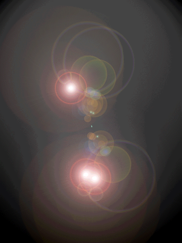
Sticking to using patterns, a "spotlight" effect was used for background 4, in the hopes that the theme 'light' might integrate with science.
After asking my target audience, they chose background number 3 to be the most effective. This will be the chosen background i will develop and continue planning.


Music Magazine Research - Kerrang (Double Page Spread)


One single image is used to show the importance of the band. The image is placed largely to show the bands dominance. Persons positioned in a way that is relevant to the text covering the band. Page split evenly distributes Text and image on separate page, this gives the reader a sense that the story is separate from the band itself, again, being relevant to the story (giving the idea that the music they make do not reflect the relationship between the two.) Text is wrapped around the arm so that it doesn’t overlay the band (again, not conflicting the story with the band.) However, the arm is placed over the page break along with the title of the article, to give the sense of flow on the article. The page spread is effective because it is in a similar style to the front cover and the same theme is used throughout with the text.

Thursday, 8 October 2009

Magazine Analysis - Kerrang (Front Cover)


The magazines cover of "Kerrang" use a variety of techniques to distinguish itself from other magazines from its genre. The genre of a 'rock magazine' is taken to an extreme in this music magazine cover. Kerrang’s slogan "Life is loud" is taken literally on its own masthead. Suggesting that the magazine itself is 'loud' the mast head's text is shown to be shattered, given the impression of not only loudness but also the idea of destruction, which links into the rock and roll lifestyle. The images of the band are often crammed in together to also suggest that the magazine itself is crammed together also. The colour scheme of the magazine is often ‘hot’ toned colours (Red e.t.c.). These colours suggest violence/destruction, which is linked in with the article title “Sex, Drugs, Violence.” The band is featured over the image of the band, which suggests that the magazine itself is well known and uses the similar layout on every magazine. The magazine is effective overall because the theme as a whole vibrant and 'loud' which catches the audience.

Thursday, 24 September 2009